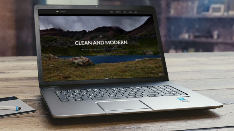
One of the more recent trends in website design is the use of video backgrounds on the home page. The concept being, large moving images will draw the viewer’s eye to a call-to-action. But are video backgrounds a good idea?

Many people think that trendy video backgrounds help a website standout in a crowd. The large moving images draw the viewer in to create an engaging experience. And the longer someone stays on your site, the better it looks for SEO, right? But in reality they are distracting the viewer from the main message and the reason they came to your site in the first place.
When someone visits your website you only have 5 seconds to capture their attention. You don’t want that time spent watching a video that was meant as a design element. You want the visitor to read your message and take action. If they can’t determine what your company is about and what they are supposed to do next within that 5 seconds, you will most likely lose them.
Why You Should Eliminate Video Backgrounds
Even though they may look cool and be part of a design trend right now, here are a few reasons why you should eliminate them from your website.
- Video backgrounds increase loading time for a page
- They distract from the primary message/call-to-action
- Autoplay videos are being blocked by web browsers
- Videos use more data on mobile devices
Design trends come and go, and in the world of web design those trends move at lightening speed. In reality a website needs to be redesigned yearly to keep up with changing trends and technologies, but this is not possible for most small businesses. Sometimes jumping on these trends can be more harmful to your business in the long run than the benefits gained in the short term.
If you’re not a cutting edge company that needs to keep up with the latest trends, then our recommendation is to consider a more evergreen approach to design. Good clean design will allow businesses to extend their website lifecycle two or three years before a redesign is needed.


